Career Profile is the logged-in platform every Meta candidate passes through: tracking your process, preparing for loops, handling paperwork, reviewing your offer. Created in 2018, it had grown into a patchwork built by different teams on an internal design system never meant to face candidates.
The exploration behind it belongs to the design team who ran it: an audit, a set of principles, and three concepts, presented to Recruiting Products leadership in August 2022.
By Q4 2022 the job was no longer to explore. It was to converge, with enough conviction and fidelity for leadership to decide. Three product designers and a design manager worked it together, in equal collaboration.
My part of it: the typology framework, the concept convergence, the timeline and card system, and the offer experience.
What we inherited
Career Profile is not a side surface. It carries the whole funnel: millions of visitors a year, and the hundreds of thousands of candidates it takes to make Meta’s tens of thousands of annual hires, across every role, level and region. Anything the platform does badly, it does at that volume.
And it was doing several things badly. Navigation did not scale, because level-one items were pages rather than categories. Every candidate saw the same content regardless of who they were. Geodesic, the internal system underneath, had no mobile web support and little brand expression.
Converging on a direction
The exploration had produced three concepts. Instead of picking a favourite we scored each on what it was good at, and concluded that none of them was the answer.
A third, Career Workplace, borrowed Workplace’s structure and social graph. Familiar, but the structure limited functionality and social networking was never validated as a candidate need.
Each was a feature idea standing in for a framework. The framework itself was missing.
The premise that unlocked it
Career Profile should be applicable to everyone, and personalisation should come from content curation rather than redesigning the surface per audience. That ruled out building a different Career Profile per candidate type.
Typologies: a shared vocabulary for pages
A typology sorts content by the mental model a user brings to it, which gives you templates instead of one-off pages. We landed on three.
Three typologies meant three templates, and a partner team building a new feature had somewhere to put it.
Five degrees of change
In worksessions in Burlingame we laid the direction out as five options from no change to overhaul, so leadership could see the trade space rather than a single recommendation. Structure first, before any visual design.
Scored against build-for-all, clarity, scale, efficiency and innovation, Timeline as Anchor won. It addressed the framework rather than the surface: the timeline is the one thing every candidate has and came to check, so organising around it let content surface contextually.
The system we built
Components need primitives to be built from, so choosing a design system was part of the implementation plan. XMDS was approved for external work but optimised for light editorial content, and our surface is dense and transactional. XDS was the internal system, running nearly every enterprise app at Meta, with its systems team adjacent to us in Enterprise Engineering.
Taking XDS external had no precedent, so we worked it through with that team rather than around them. Together we explored a People Theme: XDS primitives underneath, extended for our use case with rounded corners, softer surfaces and pops of colour.
That theme became Astryx, the AI-ready design system Meta has since launched publicly.
On top of those primitives we specified the parts. Every one had to declare four things before it earned a place: its priority, the mental model it serves, where it lives, and its states.
The cards follow the same spec. Primary above the fold in the centre column, secondary in the right rail, lower-priority below, and flex cards that resize to the candidate’s type, seniority and stage. Each is one container with a swappable payload, so a job list and an interview agenda occupy the same slot at different points in the journey.
Key screens
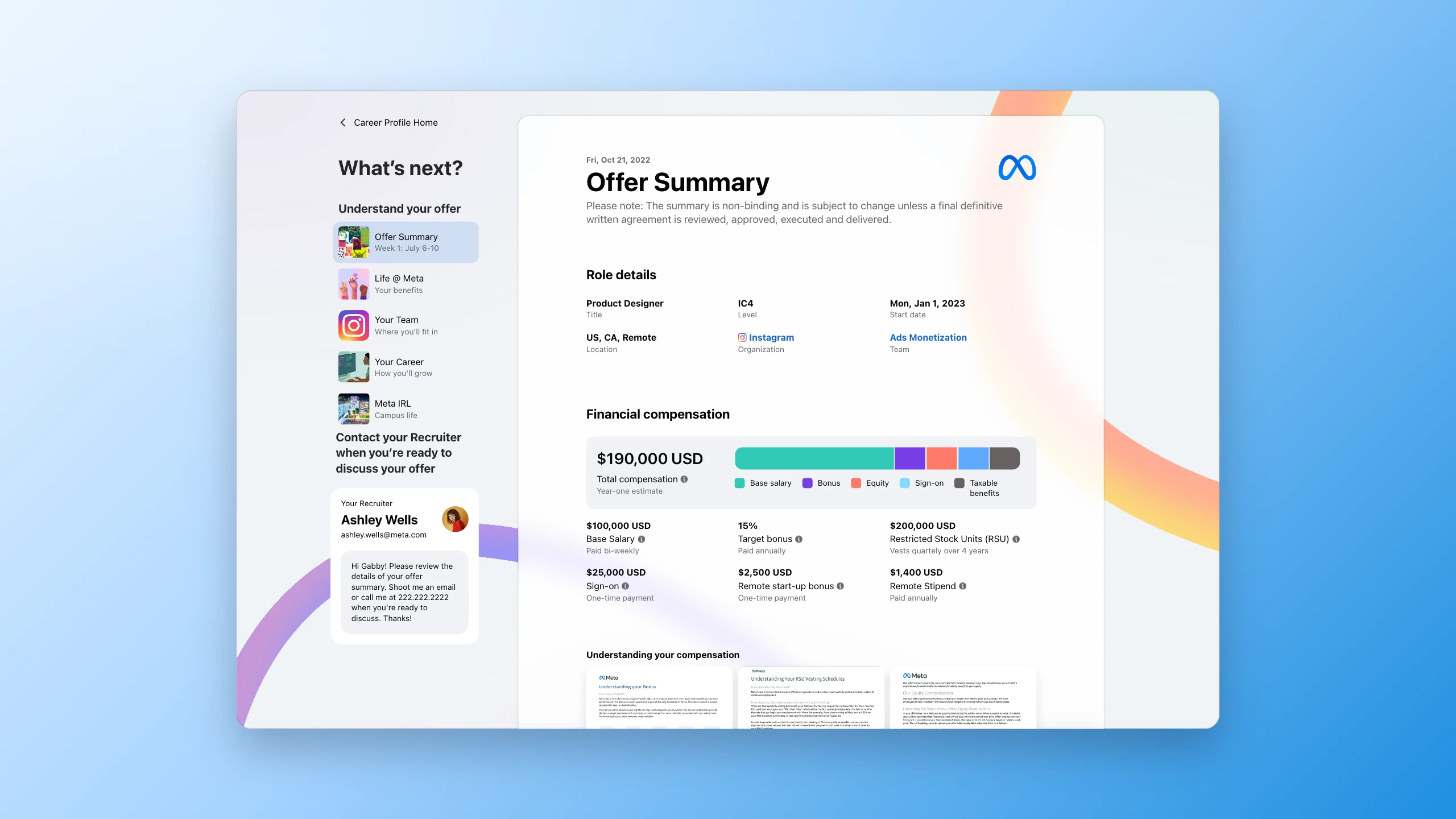
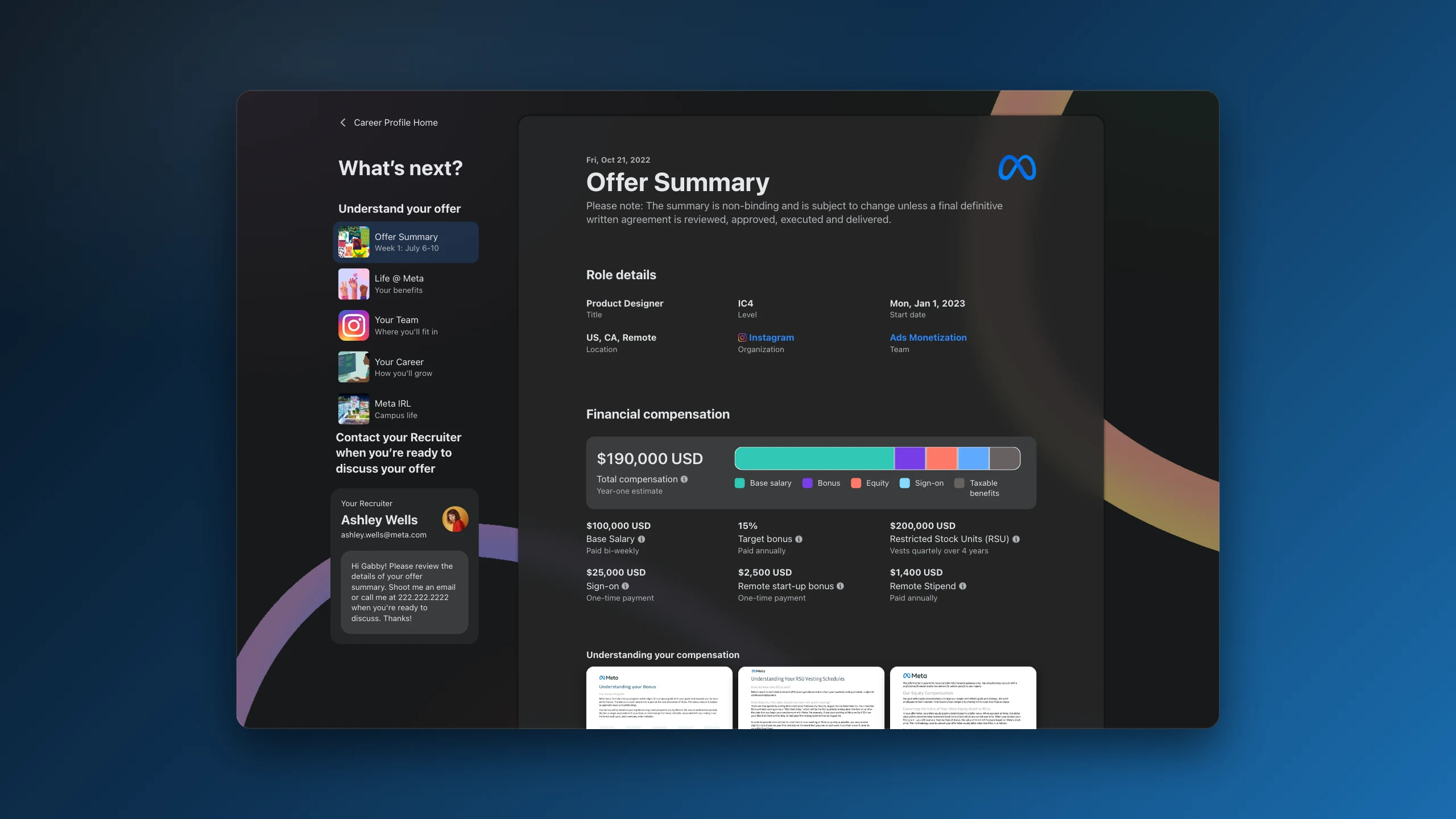
The offer experience
This part carried over from work with the Offers team: a vision brief arguing for a full-featured offer experience, which fed into this one.
Using it forced recruiters to share approved compensation values with the candidate. If transparency moved those numbers at 72% usage, a complete self-serve experience at full usage was worth designing for. The system also depended on an individual recruiter to orchestrate, so nothing guaranteed a candidate got what they needed to decide.
Two efforts ran on the offer moment in the same period. This was the self-serve half; Immersive Offers was the human half.
Through to joining
Accepting an offer is not the end of the candidate’s journey, so it is not the end of the product. Career Profile carries someone from signature to first day.
Personalisation without a second product
Two very different candidates, the same framework, different curation.
What we delivered
We took the full vision to high fidelity: the converged direction and its reasoning, the typology framework, the design-system recommendation, the component system, key screens from prospect to first day, and an interactive prototype running the journey in three candidate states.
What I took from it
Convergence is a different craft from exploration. Widening rewards generosity. Narrowing rewards evidence, and scoring five options on one spectrum is what turned a matter of taste into a decision leadership could actually make.
A framework is not a bigger feature. All three inherited concepts were good and all three sat at the wrong altitude. Anchoring to the timeline worked because it organised the product around the candidate’s state rather than around Meta’s org chart.
Fidelity is an argument, not a finish. The debate about personalisation went in circles while it stayed abstract and ended the moment two candidate types were on screen, rendered by one system.