

Product teams have a stubborn belief that design systems are slow: a quarter to stand one up, a committee to add a button. I believed it too, after years of building them inside large companies. Rift DS is my argument against it. It is 178 React components, 13 complete themes and a full AI chat widget, built by one designer and free to use under the MIT licence.
It started in February 2026 as the component library behind this portfolio, with one theme picked for me. I ended up caring more about the system than the site. It grew tests, accessibility checks and validators, then outgrew the portfolio altogether. In September it moved to its own repository, its own domain at rift-ds.com and its own package on npm, and 1.0.0 shipped on 26 September. This site now installs it like any other consumer would.
Speed comes from the rules
A system stays quick to work on when nobody has to remember its rules. In Rift they are written down once and then checked by the build, so they hold on a Friday afternoon exactly as well as on a Monday morning.
--primitive-teal-08: #0E6E8F--color-action-primary-bg: var(--primitive-teal-08)background: var(--color-action-primary-bg)The foundation is three tiers of tokens. Primitives hold raw values, semantic tokens give them roles like the action colour, and component CSS reads only the roles. Every colour role carries a light and a dark value. That one constraint is what makes the rest of this page possible: re-point the roles and every component follows.
Above the tokens sits the layer a coding agent reads first. design.md says how things look, content-design.md says how sentences read, and CLAUDE.md says where every fact lives and what never to do. Skills turn recurring work into written procedures. One scaffolds a component; others audit a page for accessibility or check the docs for drift.
Here is what happens when I add a component. I describe it in a sentence, and the new-component skill writes the component, its stylesheet and its stories, and adds it to the registry. Then the build takes over. One validator reads every line of the CSS and fails on a raw hex or pixel value, with one way past: a comment at that line naming the category and the reason. Another holds the props contract, so every component forwards its ref, passes native attributes through and documents every prop. Another fails if a component draws its own checkbox instead of the shared one. Finally CI renders every Storybook story in headless Chromium and fails on an accessibility violation.
I cannot cut a corner without leaving a signed note at the scene. Neither can anything I delegate to.
So the pace is not heroics. The artifact panel, where the chat opens a dashboard or a page it made, shipped in 1.9.0 on 14 October. QuestionCard, which lets the chat ask with answers to pick, followed in 1.10.0 four days later. On 23 October, 1.13.0 replaced every checkbox, radio and switch mark in the library with one shared drawing, across every component that shows one, and nobody upgrading had to change a line. In the teams I have worked in, that last one alone would have been a quarter on the roadmap.
One system, every look
Because components only read roles, a theme is a new set of answers to the same questions. Each look is complete: colour, typeface, corner radius, density, motion and elevation, in light and dark. One data-brand attribute switches it on, with no JavaScript at runtime. Rift ships 13 of them, and the dashboard below wears each one without knowing which.
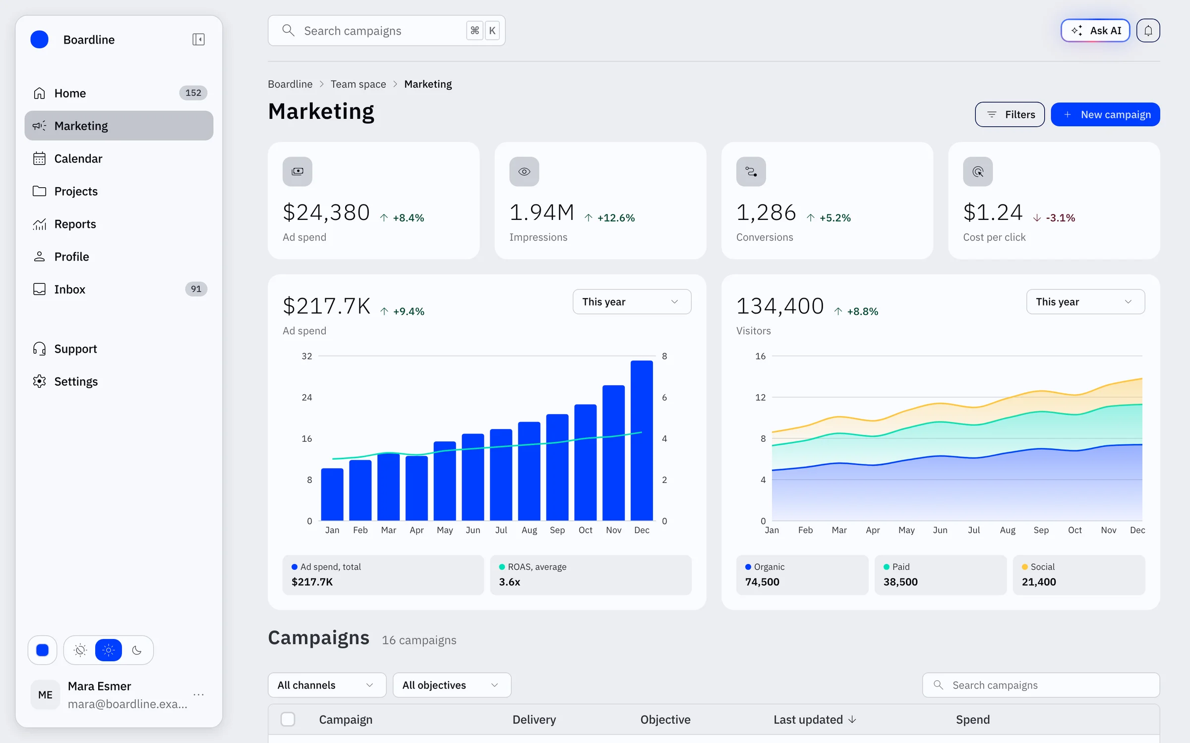
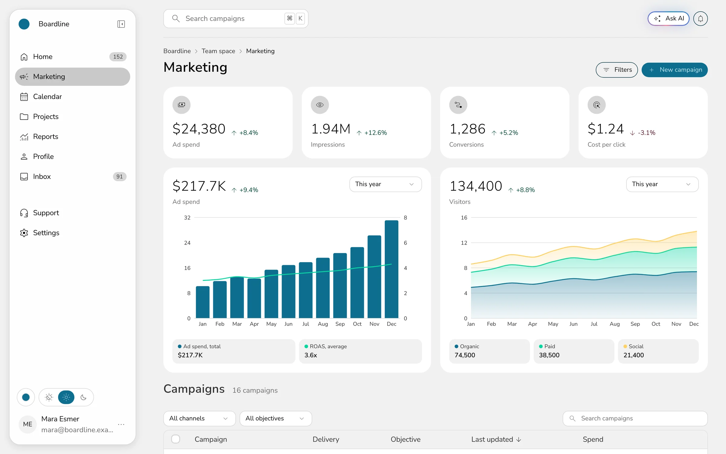
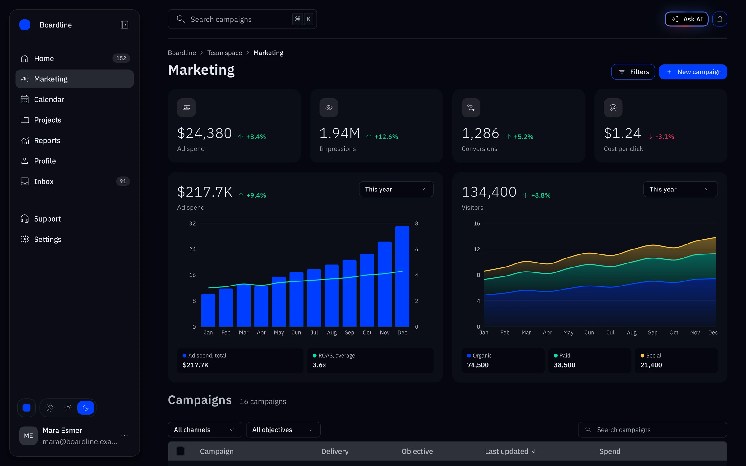
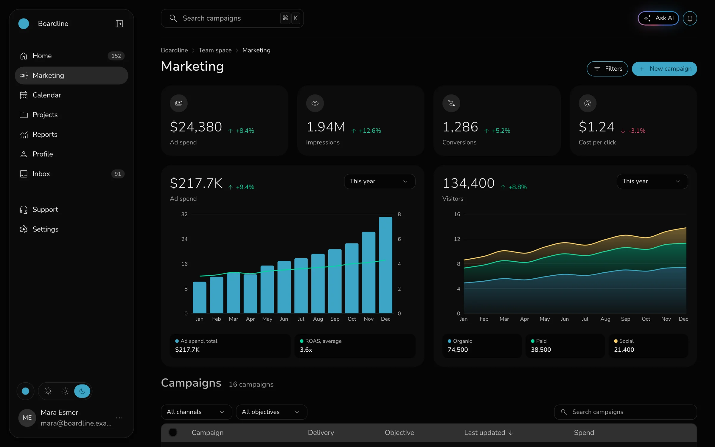
That marketing dashboard is one of the templates on rift-ds.com, built from the library alone. The cover of this case study is the same screen in Blueprint.
A description becomes a system
This is the part I most want other designers to see. A DESIGN.md is a markdown file that describes a product’s look: colours, type and corners up top, prose underneath. At TurboTax we used one to get an MCP app close to Claude’s look quickly. It worked, but it was an approximation. Every value went straight into component code, and changing the accent meant hunting down every place it lived.
Drop the same kind of file, or just an image, on the playground and the values go somewhere else. The importer fits each one to a lever the built-in themes already use, bends anything that would break a contract, like a button label falling under 4.5:1 contrast, and reports every choice it made. The components never see the file. What comes out is the real system wearing that look, exported as one AGENTS.md a coding agent can build on.
I wrote up how the importer reads a file in A DESIGN.md is not a design system. The short version: the file describes the look, and the system keeps it consistent.
An AI chat in the box
The largest single piece of Rift is its chat widget. One command, npx rift-ds init chat, writes it into a product: a provider that holds the conversation, a launcher that docks the panel beside the page or takes over the screen, and a server handler for any web-standard route. Rate limits and a daily budget come as an optional add-on over Upstash Redis.
It is easier to show than to list. A reply streams in without the thread jumping, because each new turn rises to the top of the panel and the answer fills the space beneath it. The chat can show its work as steps, ask a question with answers to pick, and open a dashboard it built in a panel beside the conversation. Every word it writes is a prop, so a product in another language can translate all of it.
The Ask button in the corner of this page is the same widget. Only the backend is mine: a Claude-backed route with its own persona and guardrails, answering from a corpus generated from the pages on this site. I wrote that half up in How to add a chat to your own site.
What it changes
Building this changed how I think about systems work. The slow part was never the components. It was the coordination: people agreeing on rules, then people remembering them. Put the rules in the build and most of that cost disappears, which means a small, focused team, or one person, can hold a system to the standard a large team would.
My judgment did not go away. It moved earlier, into the specs, the validators and the skills, and it pays out on every component after.
And because it is MIT licensed, the whole thing is anyone’s to use: the tokens, the components, the themes, the playground’s export and the chat. Start with the getting started guide, or open the playground and drop in a file of your own.